DRTY DRINKS
DRTY is a UK Hard Seltzer drinks brand. Their aim was to position themselves apart from the usual healthy-living audience that other Hard Seltzer brands market themselves towards and adopt a louder, rowdier voice; leaning towards a low culture attitude.
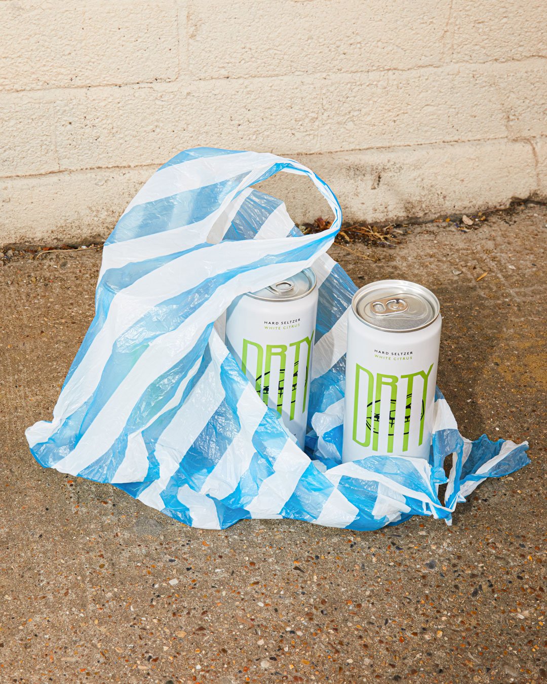
My involvement with DRTY was initially to look at a new creative direction for the brand’s Instagram. Although they were expressing their audacious messaging in copy and content - the visual style was originally a little safe and they were looking to embolden and add dynamics to the design. I led a number of visual routes which we landed on one option as a clear favourite across the team. This was a direction built from large loud chunky titles, gritty textures and a sense of misbehaviour in it’s photography. We adopted the orange, green and pink of the three drinks flavours and introduced a hot pink into it’s colour palette. The result is bold, unpretentious and represents the brand well. We extended this to an animation that was used as an online paid ad, to hit new audiences and potential customers.
Following my creative direction for the Instagram account I was invited to look at the design for a multi-pack and a variety pack. For this I transferred the styling of the social media channel to these irl packaging design projects - which included their online store for their product. My close involvement with the brand has extended to creative directing seasonal product shoots with photographer Charlie Edwards and art-working brand activations at UK festivals.
DRTY are a great brand to be involved in; they are open to disruptive ideas and approaching their market a little differently and it’s a branding brief that really allowed me to think outside the normal with a drink such as a hard seltzer brand.
DRTY PACKAGING


CREATIVE DIRECTION (SUMMER 2021)


INSTAGRAM REBRAND


